Monday, 12 December 2016
Tuesday, 6 December 2016
Friday, 2 December 2016
Friday, 18 November 2016
Thursday, 17 November 2016
Final KHS Magazine Cover
This is my final magazine cover, I have decided to stay a close as possible to my draft, but I have removed the graphic that I had above the students head, and the student I was going to use I have changed, I was also going to use the student in a school uniform or having some sort of school identification card but the students uniform was unavailable so I had to do with what was available.
I also decided to not underline the top box of the header, because I felt the need to have some space and not bombard the cover, although I feel like I could have has a bit more of a colour vary despite the fact that I think the colours I chose connotes the schools and magazines energy, so I believe it was a good choice of colours.
Tuesday, 27 September 2016
Magazine draft analysis
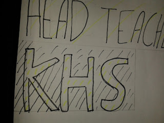
I have called my Magazine "KHS" because it was made to educate readers on the School, the pupils and the Teachers, of King Henry VIII School. Located large and in the top left of the cover, it represents and promotes the school name, displaying the traditional colours of the School which is Black and Yellow.
I have also put "Head Teachers Rise For Grades" as the header being portrayed as the main title, trying to draw readers into the main and newest story for the school!

I decided to put the "Sell Lines" predominantly on the left side of the Magazine cover so that readers automatically find it easier to read them and find them, due to the European writing systems that go from left to right, i placed the sell lines because i feel it will engage the reader easier than if they just saw a main image.

My Main image is placed directly in the centre, to engage readers and draw their attention, many children and adolescents, find reading boring (including myself) which is why i decided to put a main image taking up the centre of the page to engage readers that are just interested in the pictures, i hope to use a Sixth Form Student, or possibly a year 10/11 student, to link with the idea of it being for school, if i used a Sixth Form Student that would be controversial due to the fact that they don't have any specific clothing that represents the school.

My Pug is centred to the right next to my main image and will have a small instruction to go to a specific page, this will hopefully build up the readers interest in what the magazine has to offer, if it's a sport page i am hopeful to have a football pug, and if i decide an art page would be a better idea, i want to make it look like the pugs been splattered on the page with a dark colour to bounce off the bright colour in the masthead.

i have used two differentiating pull quotes, one saying "We are the Future" and "Be yourself", as Cliche as these may seem, i intend to inspire the readers to be themselves and be the best they can be, they are both located on the right side underneath the pug and one above the pug, to balance out the writing on the page.
Subscribe to:
Comments (Atom)


